Monday, September 30, 2013

Elements of Art and Principles of Design in Photography

Element of Art:
Lineare marks made by a pointed tool: brush, pencil, pen, etc. Lines can vary in width, direction, curvature, length, or color.

This picture has line in the back/wall, also in the front by where the legs of the man and kid are.

Shapeare formed wherever the ends of a continuous line meet.  
In the background the house has shapes, like triangle and rectangle.

ColorThey also show the relationships between complementary colors across from each other, such as blue and orange; and analogous (similar or related) colors next to each other such as yellow, green, and blue. Black and white may be thought of as colors but, in fact, they are not. White light is the presence of all color; black is the absence of reflected light and therefore the absence of color.
This photo has a lot of color like orange and yellow and reddish.

Value (Tone)or tone, refers to dark and light; the value scale refers to black and white with all gradations of gray in between.  Value contrasts help us to see and understand a two-dimensional work of art.
This photo goes dark to light from right to left.

Formdescribes objects that are three-dimensional, having length, width, and height.
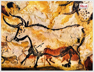
This painting has three-dimensional, the water that is going down.

Texturecan be rough, bumpy, slick, scratchy, smooth, silky, soft, prickly--the list is endless.  Texture refers to the surface quality, both simulated and actual, of artwork.
This painting shows texture, rough.

Spacerefers to distances or areas around, between, or within components of a piece. Space can be positive (white or light) or  negative (black or dark), open or closed,shallow or deep, and two-dimensional or three-dimensional. 
This painting shows a lot of space in the background

Principles of Design:
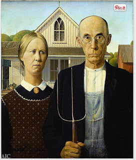
Balanceis the comfortable or pleasing arrangement of things in art.  There are three different types of balance: symmetrical, asymmetrical, and radial. The human figure is symmetrically balanced; the same on the left and right side. The tree is asymmetrically balanced; its branches are not distributed equally on each side, but their total weight is balanced left and right. The sun is an example of radial balance; all its rays are equal in length from the center.
This painting is balance because if you fold it in half it would be symmetrical.
Contrastis created by using elements that conflict with one another. Often, contrast is created using complementary colors or extremely light and dark values. Contrast creates interest in a piece and often draws the eye to certain areas. It is used to make a painting look interesting.

This painting is contrast because it shows 3-D and it makes the painting interesting.

Emphasisin the focal area of an artwork gives it importance.  An artist may stress some elements of the design over others. The eye of the viewer will focus on the area of emphasis or center of interest first, then take in the rest of the composition.
 .The painting is emphasis because it is focus on the cafe. 

Movement- in an artwork means the artist is taking viewers on a trip through the work by means of lines, edges, shapes, and colors often leading to the focal area.  Movement is a visual flow through the composition. It can be the suggestion of motion in a design as you move from object to object by way of placement and position.  Directional movement can be created with a value pattern. It is with the placement of dark and light areas that you can move your attention through the format.
This painting is showing movement because it shows color, and the movement is visual.

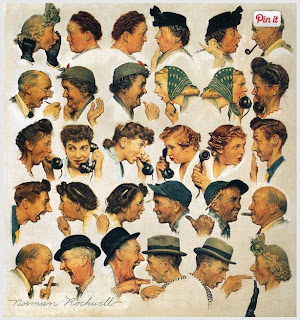
Patternare made in art when the same shapes or elements are repeated again and again.  Pattern uses the elements of art in planned or random repetitions to enhance surfaces of paintings or sculptures.
The panting shows pattern because can of food its repeating again and again.

Rhythmis the repetition of shapes, lines, and forms.  Rhythm is a movement in which some elements recurs regularly.  Like a dance, it will have a flow of objects that will seem to be like the beat of music.

This painting shows repetition of shapes.

Unity-
means that all elements in an artwork are in harmony.  Unity brings together a composition with similar units.  For example, if your composition was using wavy lines and organic shapes you would stay with those types of lines and not put in even one geometric shape.
The painting shows unity because it shows wavy lines and organic shapes.

Thursday, September 26, 2013

Photo Composition and 9/11

Simplicity- This photo shows simplicity because it is focusing on the building and the sky is the background.

Rule of Thirds- I chose this photo for the rule of thirds because the building is in the section of the thirds.

Lines- This photo, the flag shows lines from left to right.

Balance- This photo shows balance because in top shows light and in the bottom it's dark.

Framing- This photo is framing the two guys that are standing looking up to the buildings.
Merger- This photo is a merger because it cut it the head of the men and part of the fire truck.

Friday, September 20, 2013

Post Shoot Reflection

http://edgarordaz.blogspot.com/


He took a photo of red, metal, and happy.
Another positive is that I liked how he took photos the angles.
One way he could improved in his photos is that try not to move while tacking it because it comes out  kind of blurry.

40 Greatest Photos Ever

What made me pick this picture is that I liked how they took a picture when them 3 were young in the army. Then years after they took another picture, then another  picture but one was missing. What made   my eyes gravitate to the photo is the position of the photo. I think this photo made into the 40 photos ever because three sisters took photos during different times of period.
 I chose this photo because I think is really respectful of John F. Kennedy Jr. to salute his fathers coffin at really young age. What made my eyes gravitate was that the photo was just focused on John F. Kennedy Jr. I think this photo made into the 40 photos ever because the presidents son is saluting his fathers coffin.
I picked this photo because it's respectful of the father to the son to pause during the ceremony of the      10th anniversary of the Twin Towers. What caught my eyes was that it's focused on the father kneeling
during his sons name for respect. I think this photo made into the 40 photos ever because a father is kneeling for respect for his son that passed away on 9/11 in the site of the World Trade Center.


Wednesday, September 18, 2013

Great black and white photographers, PART 2

WALKER EVANS
Born: November 3, 1903  Died: April 10, 1975
Place of birth: St. Louis, Missouri
Education: Evans attended Williams College, after a year he quit his education and moved to New York. In 1927 he moved to Paris; he started to write small stories. After a year in Paris he moved back to New York and intent to become a writer.
Jobs: He worked as a photografer and a writer.
His famous work published was "Let Us Now Praise Famous Men"


National Geographic Warm-up

This is my favorite picture because I like the color of the water . I also like the way how the wave came out, over the the person who's surfing. The photo I would take in the contest would be the sprouting of a flower.

Monday, September 16, 2013

Red, Metal, and Happy


                                                                              Red
Metal
Happy

Thursday, September 12, 2013

Camera Parts


Aperture - an opening, hole, or gap
Shutter - to keep light out
Exposure - process of allowing light reach the film
Depth of Field - the distance between the nearest and the furthest objects that give an image judged to be in focus in a camera
F-stop - a camera setting corresponding to a particular f-number
Focal Length - the distance between the center of a lens or curved mirror and its focus

1. Flash button gives light to the image.
2. Power switch turns it off and on.
3. Erase button deletes the pictures.
4. Setting button set the camera.
5. Menu button takes you to the home screen.

Camera History

1. The  camera obscura's effect is known as the dark room, the achievement was that the lens focused and projecting light onto the wall of the dark chamber.
2. Invention invented in the 17th Century that helped Isaac Newton and Christian Huygens to get a closer step to the modern camera was making a high quality glass lenses.
3. The first parts invented to the first modern camera by Niepsce  were glass lens, film, and dark box.
4. The modern digital camera's and the Niepsce's camera, both work the same, the thing they have in common.
5. Digital cameras use electronic sensor called CCD to capture images.
6. Difference between the Auto Moto and Program Mode is that Auto controls the flash and exposure. The Program automatically just point and shoots.
7. The Portrait mode is used for to attempt the blur out of the background and it will use the fastest available lens setting.
8. The Sport mode is used for to freeze motion. It works to the highest shutter speed possible.
9. You should do a half press on the trigger button because you have to wait for the focus lock, in till you hear a beep it's indicating that is ready to use.
10. The symbol means a disable flash. No flash, used when there is enough light that it doesn't need a flash or light when capturing an image.
11. The symbol means an auto flash. Will use when the camera thinks theres more light needed.
12. If there is too much light in your photo it will be washed out.
13. If there is not enough light in your photo it will be too dark.
14. "Stop" is used in every aspect of photography.
15. One.
16. Two
17. Has more light
18. Has less light
19. The aperture controls the light.
20. By setting the "Aperture Opening"

Friday, September 6, 2013

Roy DeCarva
    Walker Evans
W. Eugene Smith                                                            

 I didn't really like how this picture came out because of the angle. I was wanting something different, like a different angle. This picture was just plane boring.
I like how I took this picture, it's not boring. This is the kind of angle I  was really  looking for. I think this was one of my best pictures I took.
Welcome to my blog